Everyday Carry Cost/Benefit Analysis – Better Visualization
Today, I reworked some visualizations on the EDC analysis project. Perhaps the most useful discovery was pyplot’s ‘yscale’ method. Since the mass measurements of items increase exponentially, a linear scale makes it difficult to interpret data points. Simply passing ‘log’ as an argument to ‘yscale’ plots data vertically on a log scale.
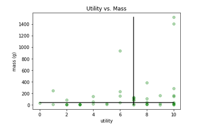 <figcaption>Before “plt.yscale(‘log)”</figcaption></figure>
 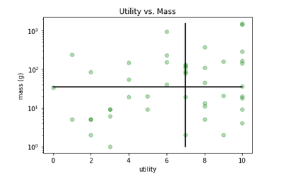 <figcaption>After “plt.yscale(‘log)”</figcaption>
Check out the method documentation here.
